
The project in short
Problem
A live cancer support app providing the same experience to audiences with different needs. This resulted in unsolicited contact with vulnerable patients, organisations using the events section to post discounts, and a steady stream of confused-user helpdesk tickets.
My role
I led research, prioritisation and design principle definition, including handling requests that arrived from the product owner's direct contact with users as solutions, separating the underlying need from the solution before deciding anything.
Discovery
Conducted desk research deliberately over patient interviews, given the sensitivity of the audience. This surfaced that recovery isn't a clean endpoint, and that patients split sharply between wanting full information and wanting none.
Key decision
Recognised that volunteering wasn't a role but a state, and moved it onto a second axis. Three person types now cover five valid states, and every other category stayed mutually exclusive.
Outcome
The volunteer team now has a clear MoSCoW-prioritised roadmap, a fluid identity model that better represents user's needs, a set of design principles and soon an app prototype to start searching for development funding.
Next step
Wireframes are being designed around "chemo brain", the cognitive fog and fatigue common during and after treatment. We are treating reduced cognitive capacity as a baseline design condition.
This is an ongoing project and no incremental release path is yet possible. The redesign we work on right now has to be convincing enough to obtain development funding.
Context
One experience serving four audiences
Oncolomeeting has been live in the app stores since beginning of 2025, connecting cancer patients, caregivers, volunteers and support organisations.
Patients started receiving unsolicited contact from volunteers. A big disruption during a very vulnerable moment. Organisations had no tools built for them, so they repurposed the app's events section to post discounts for patients. And several helpdesk requests and demo-video demands signalled that the product wasn't self-explanatory.
The underlying issue was that one experience was trying to serve four audiences with fundamentally different needs, emotional states, and reasons for being in the app.
Role & constraints
No brief, no developers, no incremental releases yet
Before a brief existed, at Nosolofilms (non-profit org. of design volunteers) we analysed the app situation and proactively approached the product owner to propose the redesign. As design lead, I led research and synthesis, facilitated working sessions with the product owner and technical lead, drove the MoSCoW prioritisation and design principle definition, and am now leading the wireframe and visual identity work.
The constraint that shapes many decisions: there is not yet an incremental or agile path available. With no developers on the volunteer team and funding still to be obtained, the design has to be comprehensive and convincing enough on its own to obtain funding for technical development. The prototype we are building needs to work as both a user validation tool and a funding proposal.
Discovery
Research that reshaped the value proposition
Given the emotional weight of the subject, we made a deliberate choice not to run exploratory user interviews. Instead, we conducted structured desk research, drawing on patient and survivor voices on social media, documented cancer journeys, and the first-hand experience of a team member who had navigated cancer herself.
Four insights reshaped the product's value proposition.
-
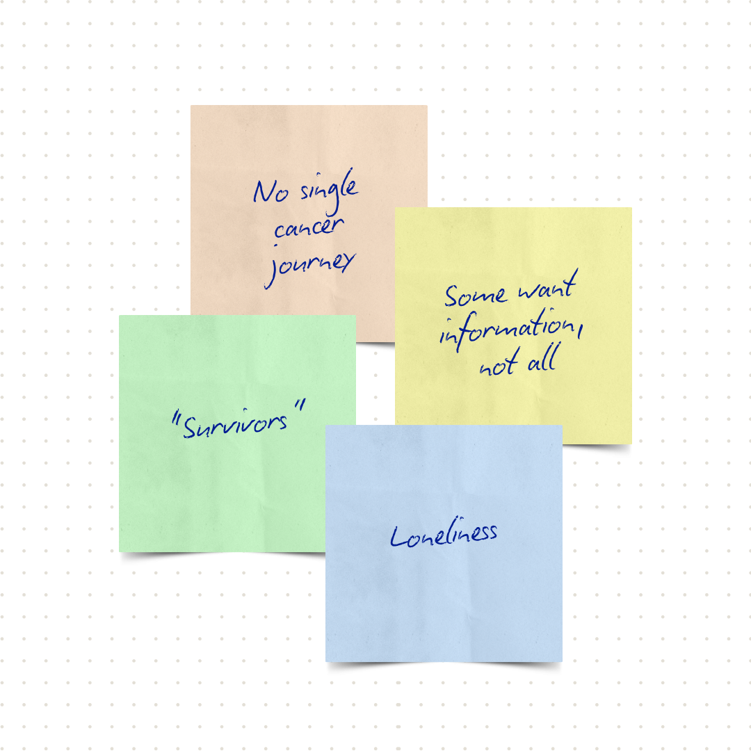
01 / There is no single cancer journey
Over 100 types of cancer, each with a different trajectory. No two patients or caregivers share the same path.
-
02 / Information need is a spectrum
Patients split sharply between those who want to know everything about their diagnosis and those who want to know nothing. A spectrum the product has to accommodate.
-
03 / "Survivors" never stop being "survivors"
And some dislike that war-related word for it... Recovery isn't an endpoint, which directly changed the patient/survivor identity already built into v1.
-
04 / Loneliness is the defining part of the experience
Described as the most isolating part of it. It is the insight that motivated the app's entire value proposition from the beginning.
The hardest part so far
One role became a switch, another stopped being a role at all
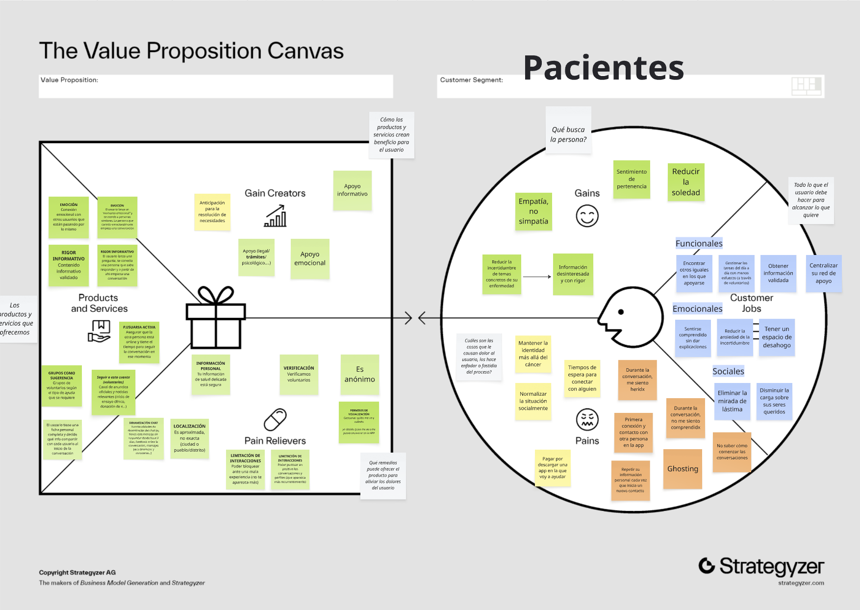
We built a Value Proposition Canvas for each audience. This work exposed a great problem in how the app categorised users. Volunteering started as one of several mutually exclusive roles, and organisations sat in the same list as if they were another kind of person. Both broke when we described real scenarios: Enma, was a patient, now wants to volunteer; Cancer Association X wants to publish their new free service; Company A just wants to provide discounts for patients as social impact initiative.
On one hand, volunteering was hard to place because it behaves as two things at once: an identity for someone who just wants to offer help, and something on top for someone already living with or close to the illness. Thus, in the final model, the base situation stays exclusive as patient or caregiver, and volunteering sits on top of it as something you switch on and off. On the other hand, organisations are not people and cannot volunteer, so they divide on a different question: are they related to cancer and have no commercial interest or not?. Cancer non-profits maintain their own profile and keep it updated; private companies or unrelated non-profits exist but are updated by an administrator.
Key decisions Step 1 of 4
Version 1 of the app considered 5 different audiences
Principles
Five guiding principles
The following principles became the shared decision-making language for the project. This matters because the product owner is in daily contact with associations and individual patients, which means requests often arrive as solutions rather than symptoms of an underlying need.
-

The user sets the pace
Nothing in the product moves faster than the person using it.
-

Lived experience as credential
Having been there is what qualifies someone to help.
-

Privacy as the default
Contact and visibility are opted into, never assumed.
-

Design for a person's worst day
The baseline user is exhausted, frightened and low on capacity.
-

The app grows with the person
Roles change over time; the product follows rather than resets.
Example of a request that wasn't the need
Several cancer associations created personal accounts and asked for a way to group their members inside the app. Before building anything, we had to separate the request from the need behind it: was the goal a single point of contact for that association, or a way for the association itself to have a presence in patients' conversations? We walked through the implications of both, rather than defaulting to how the current system already handled it.
Prioritisation
A roadmap (and a funding case)
With the role structure rebuilt and principles aligned, I led a MoSCoW prioritisation session with the product owner, technical lead and other Nosolofilms designers, turning the full feature landscape into a tiered scope: what delivers value at minimum scope, and what becomes possible as investment grows. Examples of features in MoSCoW for patients:
- Must have
-
- Search by cancer type and stage
- Accept, postpone or block requests
- Should have
-
- Topic-based group conversations
- Predefined quick replies
- Could have
-
- Chat icebreakers or predefined quick replies
- Badges and achievements for volunteers
- Won't have
-
- Commercial push notifications
- Non-verified medical advice
In progress
Designing the interface for someone's worst day
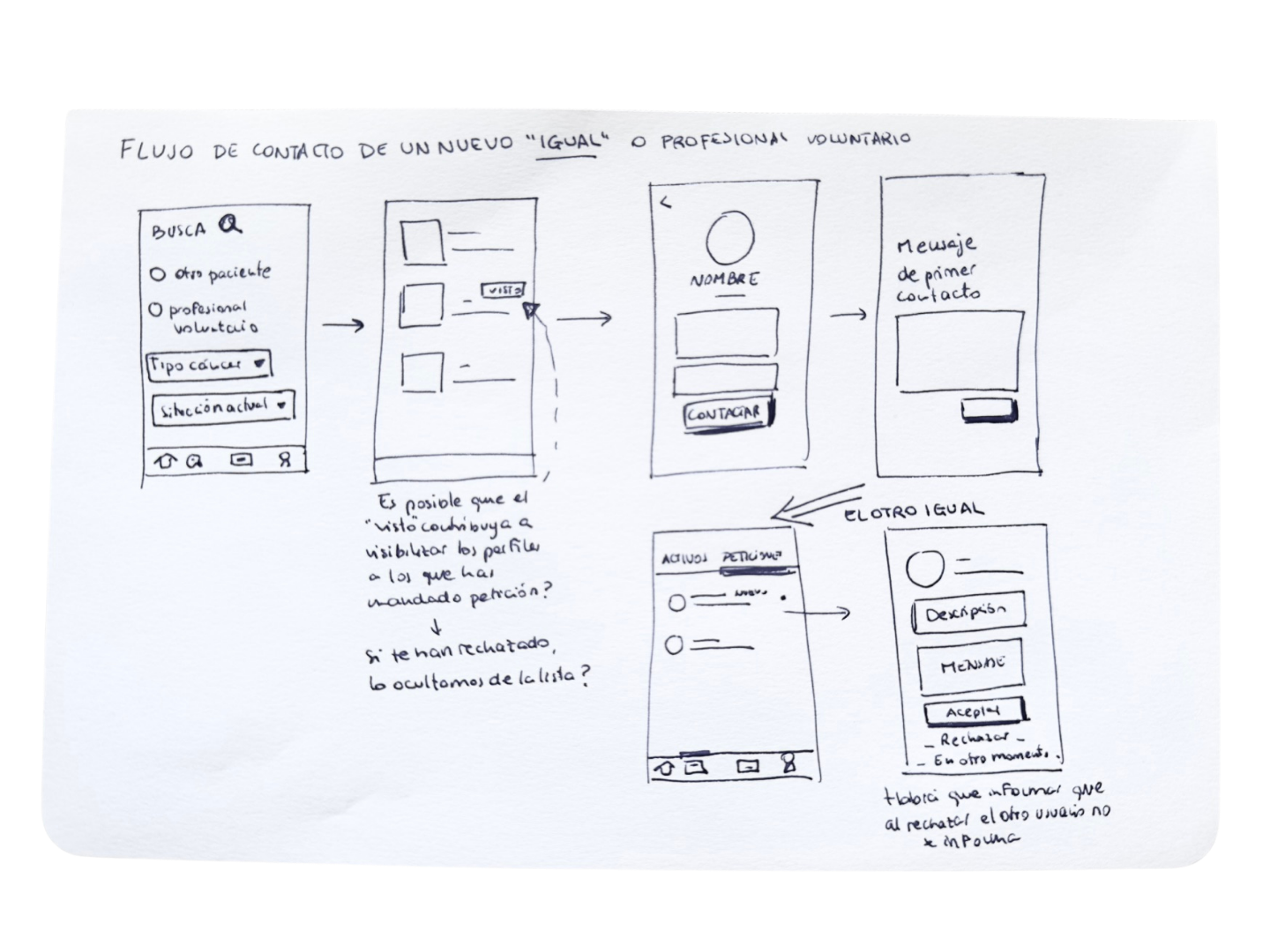
The work is now moving into wireframes and visual identity. Built audience by audience before considering how they coexist in one product. Accessibility and inclusion are embedded directly into this phase rather than added afterward: we're designing following EN 301 549 requirements and considering "chemo brain", treating reduced cognitive capacity as a baseline condition. Every interaction is also pressure-tested against Principle 4: How will this feel to someone on their worst day? That is shaping decisions on colour, typography, iconography, microcopy and empty states, since the current version doesn't visually communicate the emotional safety the product is meant to provide.
Outcome
What the volunteer team has now
The following can be key instruments when approaching foundations willing to support the app development:
-
Priorities
A clear MoSCoW scope, tiered, not a fixed backlog. Each tier carries its own trade-offs.
-
User centered architecture
An adjusted identity model that better represents users' needs.
-
Guiding principles
A set of design principles to guide future decisions.
Next step for us is to create a representative prototype to be used simultaneously for user testing and the funding pitch.
Reflection
Two things I'd change
-
01 / Include a small sample of user interviews
Desk research and team member's first-hand experience gave quite strong insights. However, a small number of patient interviews would have added more evidence or challenged our hypothesis which qualitative desk research alone couldn't provide.
-
02 / Run research and early conceptualisation in parallel
Cancer isn't one experience, it's millions of cases across different contexts. Trying to understand every one of those perspectives with the empathy the subject deserves was an overwhelming experience. We kept researching in pursuit of a fuller picture, and that pursuit ran longer than it maybe needed to. Maybe a better call would have been to treat research and role-model iteration as parallel tracks, instead of treating "done with research" as a gate for design work.
What's next?
Oncolomeeting is an active design project. If you are interested in design or development volunteering, I'd like to hear from you at martaortigosa@nosolofilms.org